
Most small business websites are built the wrong way around. The owner picks a template, writes a few paragraphs, adds some photos, and launches. Six months later they wonder why nobody is finding them, why visitors leave without doing anything, and why the site feels like a chore to update.
Building a website for your small business is not a design exercise. It is a business decision with design implications. Get the foundations right and your site becomes an asset that works while you do everything else. Get them wrong and you have a digital brochure that costs money to maintain and returns nothing.
This guide covers what actually matters: how to define your goals, what elements a small business website needs to perform, how to choose between building it yourself and hiring professionals, and the mistakes most owners do not catch until it is too late.
Having any website is no longer enough. Over 75% of consumers research a business online before visiting in person or making a purchase. What they find shapes their decision before you ever get a chance to speak with them.
A professional small business website does three things a social media profile or directory listing cannot. It gives you full control over how your business is presented. It captures visitors at the moment they are actively looking for what you offer. And it converts that attention into action, whether that means a purchase, a phone call, a booking, or a form submission.
The businesses that grow steadily online treat their website as a core business asset and invest in it accordingly. The ones that stagnate treat it as a checkbox and wonder why competitors are pulling ahead.
The most expensive mistake in small business web design is starting with the design before deciding what the site is supposed to do. If you cannot answer the questions below clearly, you are not ready to build yet.
What is the one action you want visitors to take? Every page needs a primary conversion goal. Contact form submission, product purchase, appointment booking, quote request. Pick one per page. Sites that ask visitors to do everything typically get them to do nothing.
Who is your primary audience? Not "anyone who might need my services." Be specific. A neighborhood bakery and a wholesale ingredient supplier have completely different audiences, even if both sell baked goods. Your audience determines your copy tone, your imagery choices, your navigation structure, and your calls to action.
How will you measure success? Define this before launch. Conversion rate, monthly leads, online sales, organic traffic. Without a baseline you cannot know whether the site is performing or not, and you cannot make informed decisions about what to improve.
What do visitors need to believe before they take action? That you are credible. That you understand their problem. That you have solved it for others. Your content strategy follows directly from this answer.
These are not optional. A small business website that is missing any of these is leaving money on the table.
Clear messaging above the fold. The first thing a visitor sees should answer three questions without scrolling: what you do, who you do it for, and what to do next. If they have to hunt for that information, most will not bother.
Mobile-first design. The majority of small business website traffic now comes from mobile devices. A site that does not work well on a phone is not a minor inconvenience. It is a conversion killer. Every layout decision should be made with mobile in mind first.
Fast load times. Pages that load in under two seconds have meaningfully lower bounce rates than those that take four or five. Speed is partly a technical matter and partly a design one. Every image, font, and plugin you add to a page has a cost.
Clear calls to action on every page. Visitors do not intuit what you want them to do next. Tell them explicitly, once per page, in a visible location. A button that says "Get a quote" or "Book a call" outperforms a generic "Contact us" almost every time.
Contact information that is easy to find. Phone number, email, location if relevant. Put it in the header and footer, not buried in a Contact page that requires three clicks to reach.
Basic SEO. Page titles, meta descriptions, headings structured correctly, fast load times, and mobile responsiveness. These are not advanced tactics. They are the baseline that determines whether search engines can find and rank your pages at all.
This is the question most small business owners spend too much time on. Here is a practical framework for making the decision.
Build it yourself (website builder) if: you are in the earliest stage of your business, you have a simple service or product offering, your budget is genuinely limited, and you understand that a DIY site is a starting point, not a long-term solution.
Platforms like Wix, Squarespace, and Shopify let you get something online quickly. The tradeoff is real: limited design flexibility, constrained SEO tooling, platform dependency, and a look that often signals "small business template" to sophisticated buyers.
Hire a professional if: you have validated your business model and are ready to invest in growth, your website is a primary sales or lead generation channel, your industry is competitive enough that design credibility matters, or you have outgrown a template and need something built to your specific requirements.
Professional web design is not about aesthetics. It is about building a site that converts, performs, and can be updated without a developer every time you need to change a service description.
Our recommendation for most small businesses: start with a no-code platform like Webflow rather than a drag-and-drop builder. Webflow gives you the design flexibility and SEO control of a custom build, without the maintenance overhead of a fully coded site. It is faster to launch than custom development and far more capable than basic builders.
Rather than describe what good small business web design looks like in theory, here are three projects we built and what they delivered.
Paya Health is a Los Angeles-based wellness brand creating nutrient-dense gummies designed to improve skin health from the inside out. Their philosophy is unconventional — skincare through internal nourishment rather than topical products — and their website needed to communicate that clearly before asking anyone to buy.
The challenge was not just technical. They had a strong visual identity developed by Réplica Studio, a bold and distinctive design language, and they needed a shopping experience that let that brand lead without getting in the way of the purchase. A generic Shopify template would have undermined everything the brand stood for.
We built a headless Shopify store from scratch, translating the existing design system into a fully functional e-commerce platform. Rather than hard-coding every layout, we built a library of composable page patterns using modular shapes, which means the Paya team can build and update pages independently without ever calling a developer. All interactive elements and animations were implemented natively in the build, not layered on through third-party plugins, keeping the site fast and the experience cohesive.
The result was a site that felt like the brand, not like an e-commerce template wearing the brand's colors. Monthly online sales increased by 34%.

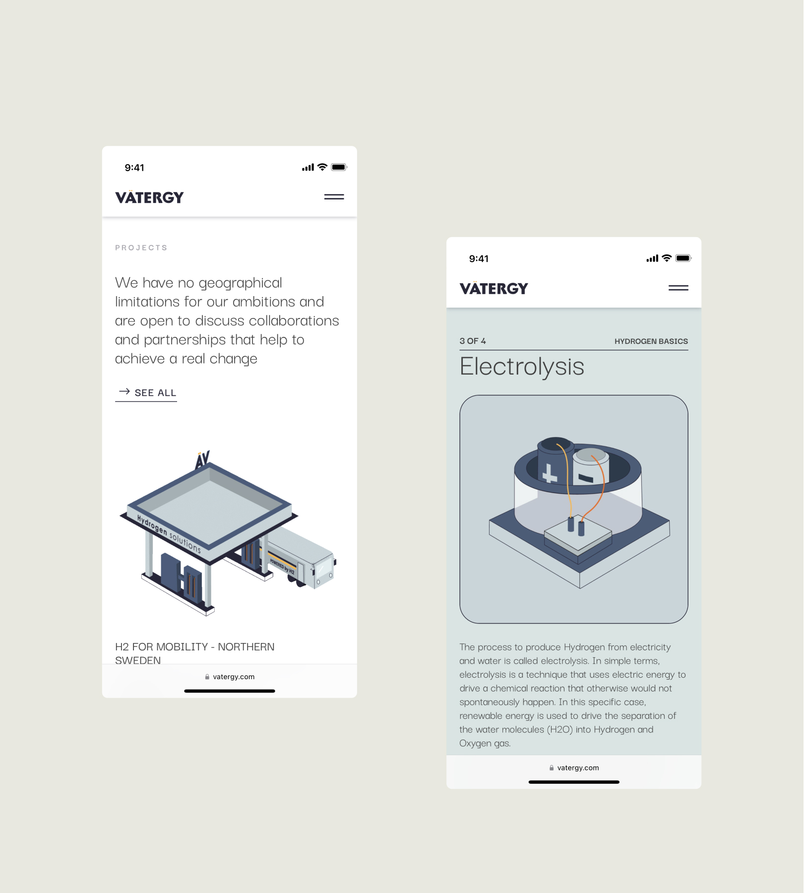
Vatergy is a renewable energy startup working on green hydrogen solutions for industrial and corporate clients. Their product is technically sophisticated, and their sales cycle involves convincing decision-makers who understand business outcomes but not necessarily the science behind hydrogen electrolysis.
The website had one job: take something that engineers understand intuitively and make it clear, credible, and compelling to a business buyer in under two minutes. We approached this as a communication problem first and a design problem second.
Custom illustrations broke down the hydrogen production process into visual steps that did not require technical background to follow. Animated sequences showed how the technology integrates into existing infrastructure. Informational sections built the case from problem — carbon emissions, energy costs, regulatory pressure — through to Vatergy's specific solution and its commercial advantages.
Every section was designed to move a skeptical reader one step closer to a conversation. The site worked. It contributed directly to closing multiple partnership deals for the company.
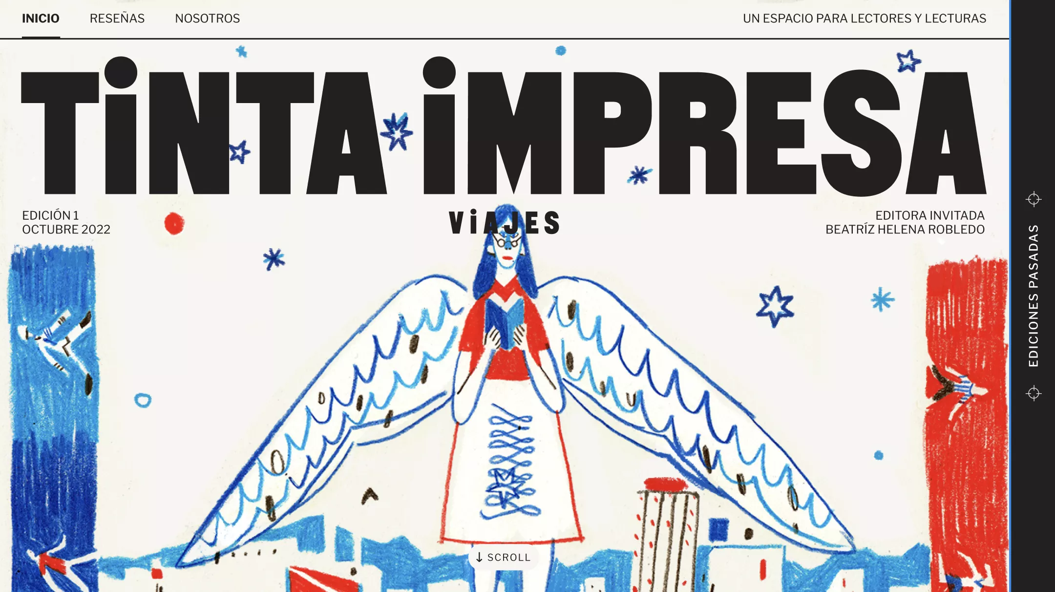
Tinta Impresa is a digital magazine with a specific mission: to promote reading culture through themed editorial editions that treat each issue as a visual and intellectual experience. Each edition has its own design language, its own mood, its own identity within the magazine's broader brand.
The problem was operational. Their editorial team was creative and opinionated but not technical. Publishing a new themed edition required either developer involvement or settling for a layout that did not match the vision. Neither option was sustainable if they wanted to grow.
We built a custom WordPress system that gave non-technical editors full control over the visual composition of each edition. The system included a structured set of flexible layout blocks that could be combined in enough ways to produce genuinely distinctive results, without requiring anyone to write code or work around platform limitations. The editorial team could now execute their creative vision independently.
The outcome was a magazine that could scale its publishing cadence without scaling its technical overhead. Readership grew by 28% through improved search discoverability and a direct-traffic experience that gave returning readers a reason to come back regularly.
Each of these projects started with a clear brief about what the site needed to accomplish. Paya needed to sell without friction. Vatergy needed to educate and persuade. Tinta Impresa needed to publish with creative freedom. The design followed from those briefs, not the other way around.
These show up in almost every site we are asked to redesign or fix.
Trying to say everything on the homepage. The homepage is a routing layer, not a brochure. Its job is to get the right visitor to the right page. When it tries to cover every service, every product, and every message at once, it ends up communicating nothing clearly.
Launching without a content plan. A website without a plan for keeping it current degrades quickly. Blog posts from two years ago, outdated team pages, service descriptions that no longer match what you offer. These are all signals to visitors and search engines that the business is not paying attention.
Prioritizing looks over performance. A beautiful site that loads slowly, ranks poorly, or makes it hard for visitors to take action is not a good website. It is an expensive one. Performance metrics matter more than visual awards.
Building more than you need at launch. Most small businesses launch with more pages, more features, and more complexity than they need. Start with what you actually use. A focused five-page site that does one thing well will outperform a sprawling twenty-page site built for a business that does not exist yet.
Not measuring anything. If you do not set up analytics before launch, you have no way of knowing what is working. Traffic sources, conversion rates, bounce rates by page. These numbers tell you where to invest next. Without them, every decision is a guess.
Small business web design does not have one right answer. It has a right answer for your specific situation. Here is how to think about it.
If you are pre-revenue or in the earliest stage: use a simple builder, spend as little as possible, and focus on validating your business. Do not invest heavily in a website until you know what you are building it for.
If you are generating revenue but growing: this is the moment to invest. A professionally designed site built with a no-code platform like Webflow typically costs between $5,000 and $15,000 for a small business scope, and delivers compounding returns through better conversion rates, improved search visibility, and a brand presence that matches where you are going.
If you are established but your site is outdated: you almost certainly need a redesign, not a refresh. Read the signs. If your sales team apologizes for the site before sending the link, if traffic is declining without an obvious reason, or if your site looks nothing like the business you have become, it is time.
At Contra Studio, we work with small and growing businesses at every stage of this journey. If you are not sure where your business fits or what kind of website investment makes sense right now, let's have a conversation